












Theme guide Home Assistant themes in 2026
Graphite for Home Assistant
A calm, neutral, low-contrast theme in light and dark. The pick when you want the dashboard to recede into the wall rather than perform.
Updated 26 August 2026
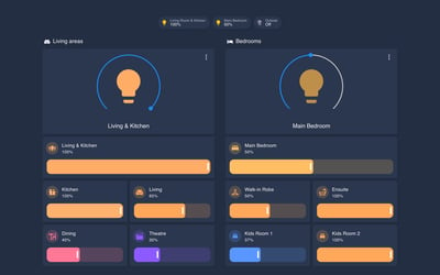
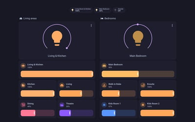
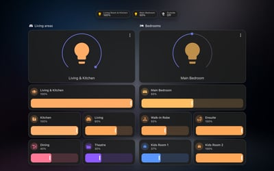
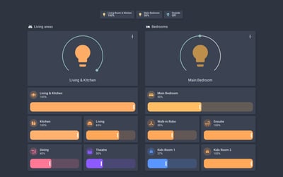
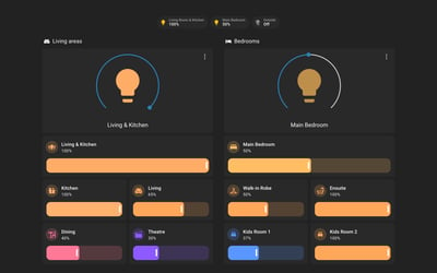
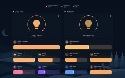
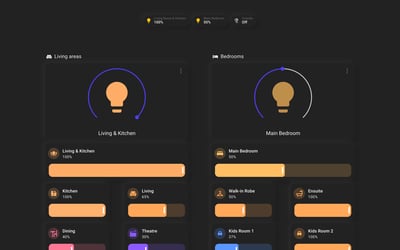
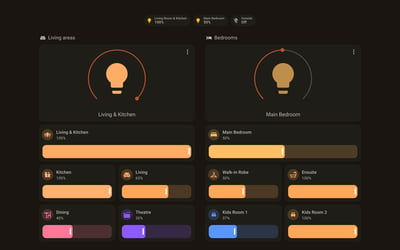
Graphite is the theme to install when you do not want the dashboard to shout. Neutral greys, soft contrast, and light and dark variants that both keep the same quiet register. On a wall panel it reads more like a fitted control surface than a tablet running an app, which is the point.
It is also carefully maintained. Recent releases have gone into fixing contrast ratios against accessibility guidelines rather than chasing new looks, and the project shipped an update within weeks of the May 2026 component changes.
Variants
Dark
Soft greys on near-black. Easy on the eyes at night without going full black.
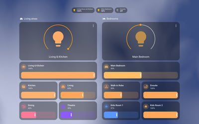
Light
The same restraint in light form, for bright rooms.
Frequently asked questions
Does Graphite have a light mode?
Yes. Light and dark variants are both registered, so it follows the light and dark setting in your profile.
Will it style custom cards like Mushroom?
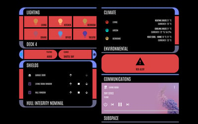
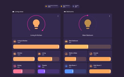
Mostly. Any card that reads the standard Home Assistant theme variables picks up the palette automatically. Cards that hard-code their own colours will keep them.
More theme guides
See the full roundup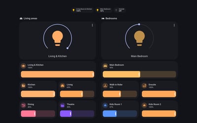
Still need a hand?
We answer most messages within one business day. If your question is about an existing order, have your order number ready. It speeds things up.
Contact us