









Dashboard guide Home Assistant dashboards
A living room dashboard
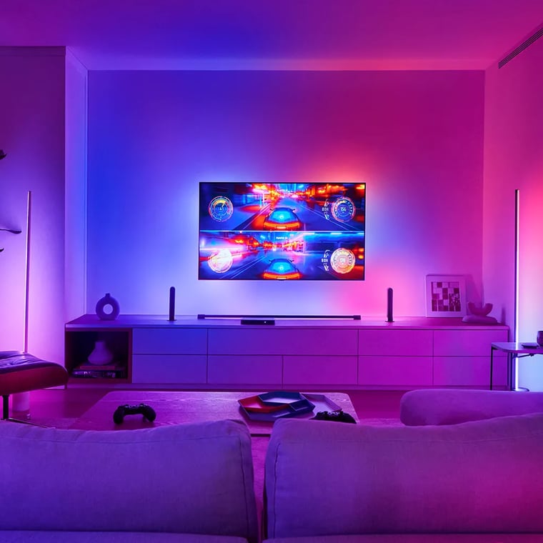
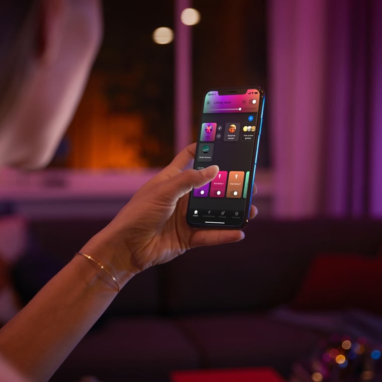
Everything you reach for from the couch, on one screen: a brightness slider you drag with your thumb, six colour presets that show the colour they set, and six one tap scenes. The media card, blinds and air conditioner sit alongside them. Built for Philips Hue lights and a Sonos amp, with card-mod for the colour dots.
What you need
Everything below installs through HACS in a couple of minutes. Anything not listed is built into Home Assistant, and the dashboard reads your active theme.
card-mod (HACS) Required
Philips Hue Required
Sonos Required
Actron Air Required
Make it yours
Entity IDs are unique to every Home Assistant install, so the YAML ships with ours. Swap in your own values here and apply — the code below updates in place. You'll find your entity IDs under Settings → Devices & services → Entities.
Unapplied changes
Copy the YAML
Paste this into a brand new dashboard, never over a working one. Captured on Home Assistant 2026.7.1.
- In Home Assistant, open Settings, then Dashboards.
- Select Add dashboard and choose New dashboard from scratch.
- Open the new dashboard, then the pencil icon to enter edit mode.
- From the top-right menu choose Raw configuration editor.
- Paste the code below over the contents and save. The values you applied above are already in it.
# A living room dashboard
# From Synced: https://synced.com.au/learn/ecosystems/home-assistant/dashboards/living-room
# Captured on Home Assistant 2026.7.1
views:
  - title: Living Room
    path: living-room
    type: sections
    max_columns: 2
    sections:
      - type: grid
        cards:
          - type: heading
            heading: Lights
            heading_style: title
            icon: mdi:lightbulb-group
          - type: tile
            entity: light.living_lights
            name: Living Lights
            icon: mdi:sofa
            features_position: bottom
            features:
              - type: light-brightness
            grid_options:
              columns: 12
              rows: 2
          - type: button
            name: Warm
            show_name: false
            show_state: false
            icon: mdi:circle
            icon_height: 30px
            tap_action:
              action: perform-action
              perform_action: light.turn_on
              target:
                entity_id: light.living_lights
              data:
                color_temp_kelvin: 2200
            card_mod:
              style: |
                ha-card {
                  --paper-item-icon-color: rgb(255,147,41) !important;
                }
                ha-card ha-icon, ha-card ha-state-icon {
                  color: rgb(255,147,41) !important;
                }
            grid_options:
              columns: 2
              rows: 1
          - type: button
            name: Cool
            show_name: false
            show_state: false
            icon: mdi:circle
            icon_height: 30px
            tap_action:
              action: perform-action
              perform_action: light.turn_on
              target:
                entity_id: light.living_lights
              data:
                color_temp_kelvin: 5000
            card_mod:
              style: |
                ha-card {
                  --paper-item-icon-color: rgb(205,225,255) !important;
                }
                ha-card ha-icon, ha-card ha-state-icon {
                  color: rgb(205,225,255) !important;
                }
            grid_options:
              columns: 2
              rows: 1
          - type: button
            name: Peach
            show_name: false
            show_state: false
            icon: mdi:circle
            icon_height: 30px
            tap_action:
              action: perform-action
              perform_action: light.turn_on
              target:
                entity_id: light.living_lights
              data:
                rgb_color: [255, 175, 140]
            card_mod:
              style: |
                ha-card {
                  --paper-item-icon-color: rgb(255,175,140) !important;
                }
                ha-card ha-icon, ha-card ha-state-icon {
                  color: rgb(255,175,140) !important;
                }
            grid_options:
              columns: 2
              rows: 1
          - type: button
            name: Rose
            show_name: false
            show_state: false
            icon: mdi:circle
            icon_height: 30px
            tap_action:
              action: perform-action
              perform_action: light.turn_on
              target:
                entity_id: light.living_lights
              data:
                rgb_color: [255, 80, 120]
            card_mod:
              style: |
                ha-card {
                  --paper-item-icon-color: rgb(255,80,120) !important;
                }
                ha-card ha-icon, ha-card ha-state-icon {
                  color: rgb(255,80,120) !important;
                }
            grid_options:
              columns: 2
              rows: 1
          - type: button
            name: Violet
            show_name: false
            show_state: false
            icon: mdi:circle
            icon_height: 30px
            tap_action:
              action: perform-action
              perform_action: light.turn_on
              target:
                entity_id: light.living_lights
              data:
                rgb_color: [150, 90, 255]
            card_mod:
              style: |
                ha-card {
                  --paper-item-icon-color: rgb(150,90,255) !important;
                }
                ha-card ha-icon, ha-card ha-state-icon {
                  color: rgb(150,90,255) !important;
                }
            grid_options:
              columns: 2
              rows: 1
          - type: button
            name: Ocean
            show_name: false
            show_state: false
            icon: mdi:circle
            icon_height: 30px
            tap_action:
              action: perform-action
              perform_action: light.turn_on
              target:
                entity_id: light.living_lights
              data:
                rgb_color: [60, 140, 255]
            card_mod:
              style: |
                ha-card {
                  --paper-item-icon-color: rgb(60,140,255) !important;
                }
                ha-card ha-icon, ha-card ha-state-icon {
                  color: rgb(60,140,255) !important;
                }
            grid_options:
              columns: 2
              rows: 1
          - type: heading
            heading: Scenes
            heading_style: title
            icon: mdi:gesture-tap-button
          - type: button
            name: Movie
            icon: mdi:movie-open
            show_state: false
            icon_height: 36px
            tap_action:
              action: perform-action
              perform_action: light.turn_on
              target:
                entity_id: light.living_lights
              data:
                brightness_pct: 12
                color_temp_kelvin: 2200
            grid_options:
              columns: 4
              rows: 2
          - type: button
            name: Sports
            icon: mdi:football-australian
            show_state: false
            icon_height: 36px
            tap_action:
              action: perform-action
              perform_action: light.turn_on
              target:
                entity_id: light.living_lights
              data:
                brightness_pct: 100
                color_temp_kelvin: 4000
            grid_options:
              columns: 4
              rows: 2
          - type: button
            name: Relax
            icon: mdi:weather-night
            show_state: false
            icon_height: 36px
            tap_action:
              action: perform-action
              perform_action: scene.turn_on
              target:
                entity_id: scene.living_room_relax
            grid_options:
              columns: 4
              rows: 2
          - type: button
            name: Read
            icon: mdi:book-open-page-variant
            show_state: false
            icon_height: 36px
            tap_action:
              action: perform-action
              perform_action: scene.turn_on
              target:
                entity_id: scene.living_read
            grid_options:
              columns: 4
              rows: 2
          - type: button
            name: Nightlight
            icon: mdi:weather-sunset-down
            show_state: false
            icon_height: 36px
            tap_action:
              action: perform-action
              perform_action: scene.turn_on
              target:
                entity_id: scene.living_room_nightlight
            grid_options:
              columns: 4
              rows: 2
          - type: button
            name: All off
            icon: mdi:power
            show_state: false
            icon_height: 36px
            tap_action:
              action: perform-action
              perform_action: light.turn_off
              target:
                entity_id: light.living_lights
            grid_options:
              columns: 4
              rows: 2
      - type: grid
        cards:
          - type: heading
            heading: Media
            heading_style: title
            icon: mdi:speaker
          - type: media-control
            entity: media_player.living_room_2
            grid_options:
              columns: 12
              rows: 3
          - type: heading
            heading: Room
            heading_style: title
            icon: mdi:home-outline
          - type: tile
            entity: cover.living_roller_left
            name: Left
            features_position: bottom
            features:
              - type: cover-position
            grid_options:
              columns: 6
              rows: 2
          - type: tile
            entity: cover.living_roller_right
            name: Right
            features_position: bottom
            features:
              - type: cover-position
            grid_options:
              columns: 6
              rows: 2
          - type: tile
            entity: climate.living
            name: Air conditioner
            icon_tap_action:
              action: toggle
            features_position: bottom
            features:
              - type: target-temperature
            grid_options:
              columns: 12
              rows: 2
About this dashboard
A living room is the room you sit in, so this dashboard is built around the things you change without getting up. The big one is brightness, and the tile card's brightness feature gives you a bar you drag with a thumb rather than a dial you have to aim at. It fills with the lamp's actual colour, so the control tells you the state as well as setting it.
Under it sit six colour presets. Getting those to look right is the one place this dashboard stops being stock Home Assistant, and it is worth explaining because the reason is not obvious. The tile card takes a colour option, but it only paints the icon in that colour when the entity is active. With the lights off, all six swatches fall back to identical grey, which makes a row of colour presets that show no colours. No combination of built in options gets around it. card-mod does, by forcing the icon colour per swatch, and that is the single dependency in this config. Without card-mod the dashboard still works, the dots are just grey until the lights come on.
The swatch colours are chosen to match what the globes actually produce rather than to look pretty in a screenshot. Warm is roughly 2200K amber, Cool is roughly 5000K near white rather than a sky blue, and where a swatch drives an rgb colour the service call sets the same values the dot displays. A preset that promises a colour the light will not make is worse than no preset.
The scenes row mixes two kinds of thing deliberately. Relax, Read and Nightlight call Philips Hue scenes that already exist in the app. Movie and Sports do not: they are brightness and colour temperature set directly in the button, because this house has no scene for either. That is the honest version of a movie mode. A better one drops the blinds and switches the amp to its TV input at the same time, which needs a script rather than a button, and a script is the natural next step once you have used the row for a week.
The two columns finish at exactly the same height, and that is arithmetic rather than nudging. A grid row in a sections view is 56px plus an 8px gap, and a heading card is not a grid row at all: it costs a flat 32px. Two columns line up only when the grid row totals and the heading counts both match. Here each column runs seven grid rows and two headings. That is why the blinds and the air conditioner share one Room heading instead of having one each, and why the media card carries an explicit rows: 3.
One deliberate omission. The air conditioner tile has a target temperature and a tappable icon, and no mode buttons, because it is a zone of a ducted system. One compressor serves the house, so the mode is a whole system decision. The zone entity will happily report the full mode list and Home Assistant will happily render the buttons, but they would not mean anything.
Entity IDs are left exactly as they are in the house this came from. Swap them for yours; the structure does not change.
Frequently asked questions
Do I need to install anything to use this dashboard?
Only card-mod, from HACS, and only for the colour presets. Every card here is built into Home Assistant. Without card-mod the dashboard works exactly the same and the six colour dots render grey until the lights are on, so it degrades rather than breaks.
Why do the colour presets need card-mod at all?
Because the tile card only paints its icon in the colour you configure when the entity is active. With the lights off every swatch falls back to grey, so a row of colour presets shows no colours. card-mod forces the icon colour regardless of state. There is no built in way to do it.
Are Movie and Sports real scenes?
No. They set brightness and colour temperature directly from the button, because this house has no scene for either. It works, but a fuller version would also drop the blinds and switch the amp to its TV input, and that needs a script. Point the button at your script and nothing else changes.
Why does the air conditioner tile have no heating or cooling buttons?
It is a zone of a ducted system, and one compressor serves the whole house, so the mode belongs to the master unit rather than the room. The zone entity reports the full mode list anyway, so Home Assistant will let you add the buttons. They would look like independent control and would not be.
How do I keep both columns the same height if I add a card?
Count in grid rows and headings separately. A grid row is 56px plus an 8px gap; a heading card is not a grid row and costs a flat 32px. Two columns match only when both totals match. Adding a card to one side usually means adding or merging a heading on the other.
Will this work without Philips Hue?
Yes. The brightness slider and the colour presets work with any light that supports brightness and colour, and the colour presets call plain light.turn_on rather than anything Hue specific. Only Relax, Read and Nightlight point at Hue scenes, so swap those three for your own scenes.
Still need a hand?
We answer most messages within one business day. If your question is about an existing order, have your order number ready. It speeds things up.
Contact us