










Card guide Home Assistant custom cards
Bubble Card for Home Assistant
A single card type that takes the shape of whatever you point it at, from a light slider to a media player, plus pop-ups that let one dashboard hold a page per room. Most people install it for the look and the pop-ups together.
What it is
Bubble Card is one card type, not a family of them. You add custom:bubble-card, set card_type, and the card becomes a light button, a media player, a cover control or a climate control. That is why the type string is identical on every element below.
The look is the obvious draw: rounded, low contrast, closer to a phone app than to stock Home Assistant. Underneath it there is more than styling. The button doubles as a slider, so brightness and cover position are a drag rather than a tap into a dialog. Sub-buttons attach small controls to the right of any card, which is how one row ends up carrying a light, a blind and a thermostat.
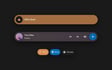
The pop-up is the part that changes how a dashboard is put together. A pop-up stays hidden until something navigates to it, so one dashboard can hold a view per room and reach them from the buttons stack fixed along the bottom. The shot below is one opened, which is the only state in which there is anything to see.
Install it through HACS.
Worth knowing before you commit: Bubble Card wants to own the whole dashboard rather than sit alongside stock cards, and the horizontal buttons stack has to be the last card in a view and cannot go inside a stack. If you only want a nicer light control on an otherwise stock dashboard, the Tile card gets you most of the way with nothing extra to maintain.
What it gives you
Shot on Home Assistant 2026.7.1. Stock is Home Assistant with no theme installed; a theme changes how these look, not what they do.
Theme
Button
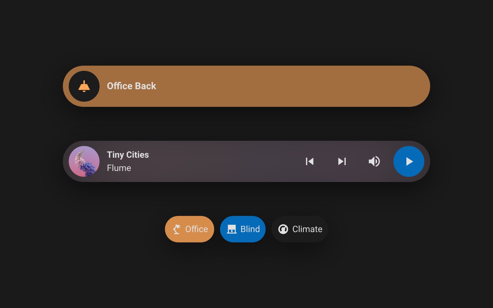
custom:bubble-card A switch, a slider, a state readout or a plain text label depending on how you set it, with the slider taking the colour of the light it controls.
Show the YAML
type: custom:bubble-card
card_type: button
button_type: slider
entity: light.office_back
name: Office Back
icon: mdi:ceiling-light
card_layout: large
Media player
custom:bubble-card Controls a media player and can pull the album art in as a blurred card background, so what is playing reads at a glance.
Show the YAML
type: custom:bubble-card
card_type: media-player
entity: media_player.unnamed_room
name: Garage
card_layout: large
cover_background: true
Cover
custom:bubble-card Opens, closes and positions a cover, with its own open and closed icons so a blind at rest still tells you which way it is sitting.
Show the YAML
type: custom:bubble-card
card_type: cover
entity: cover.living_roller_right
name: Living Right
icon_open: mdi:roller-shade
icon_close: mdi:roller-shade-closed
card_layout: large
Climate
custom:bubble-card Sets the mode and target temperature of a climate entity, with plus and minus controls rather than a dialog.
Show the YAML
type: custom:bubble-card
card_type: climate
entity: climate.living
name: Living
card_layout: large
Select
custom:bubble-card Puts a select or input_select on the dashboard as a dropdown, for the settings that are a list of options rather than an on and off.
Show the YAML
type: custom:bubble-card
card_type: select
entity: select.front_door_recording_mode
name: Front Door Recording
icon: mdi:cctv
Calendar
custom:bubble-card Lists upcoming events from one or more calendar entities, grouped by day and scrollable, with a colour per calendar.
Show the YAML
type: custom:bubble-card
card_type: calendar
days: 14
limit: 3
entities:
  - entity: calendar.maroondah_city_council
    color: '#43a047'
Separator
custom:bubble-card A labelled divider for breaking a long column into sections, with an optional icon.
Show the YAML
type: custom:bubble-card
card_type: separator
name: Downstairs
icon: mdi:sofa
Sub-buttons
custom:bubble-card A row of small buttons on its own, for the controls that do not each deserve a full card.
Show the YAML
type: custom:bubble-card
card_type: sub-buttons
hide_main_background: true
sub_button:
  main: []
  bottom:
    - name: Quick actions
      buttons_layout: inline
      justify_content: center
      group:
        - entity: light.office_back
          name: Office
          icon: mdi:desk-lamp
          show_name: true
          fill_width: false
          tap_action:
            action: toggle
        - entity: cover.living_roller_right
          name: Blind
          icon: mdi:roller-shade
          show_name: true
          fill_width: false
        - entity: climate.living
          name: Climate
          icon: mdi:thermostat
          show_name: true
          fill_width: false
Horizontal buttons stack
custom:bubble-card A scrolling row of navigation buttons fixed to the bottom of the view, which is how a Bubble dashboard moves between rooms and pop-ups.
Show the YAML
type: custom:bubble-card
card_type: horizontal-buttons-stack
1_name: Living
1_icon: mdi:sofa
1_link: '#living'
2_name: Kitchen
2_icon: mdi:silverware-fork-knife
2_link: '#kitchen'
3_name: Office
3_icon: mdi:desk
3_link: '#office'
4_name: Garage
4_icon: mdi:garage
4_link: '#garage'
Pop-up
custom:bubble-card A hidden panel that opens over the dashboard when something navigates to it, holding any cards you like, which is how one dashboard carries a page per room.
Show the YAML
type: custom:bubble-card
card_type: pop-up
popup_mode: centered
hash: '#living'
name: Living room
icon: mdi:sofa
cards:
  - type: custom:bubble-card
    card_type: button
    button_type: slider
    entity: light.office_back
    name: Office Back
    icon: mdi:ceiling-light
  - type: custom:bubble-card
    card_type: cover
    entity: cover.living_roller_right
    name: Living Right
  - type: custom:bubble-card
    card_type: climate
    entity: climate.living
    name: Living
The repository
 Clooos/Bubble-Card A single card type that takes the shape of whatever you point it at, from a light slider to a media player, plus pop-ups that let one dashboard hold a page per room. Most people install it for the look and the pop-ups together.
View on GitHub
Clooos/Bubble-Card A single card type that takes the shape of whatever you point it at, from a light slider to a media player, plus pop-ups that let one dashboard hold a page per room. Most people install it for the look and the pop-ups together.
View on GitHub
- Author
- Clooos @Clooos
- Latest release
- v3.4.2 14 October 2026
- GitHub stars
- 4.7k
- Install via
- HACS Free, MIT
Maintenance: Actively maintained and moving quickly. Version 3.3.0 landed on 28 August 2026 and is the largest release the project has done, but several visual regressions were reported in the days after it, including an invisible slider fill and a pop-up header that stays put on back navigation. The entity suggestions need Home Assistant 2026.6 or newer.
Built in instead: The core Tile card covers basic entity control, and its features add a brightness or cover position slider. Sections views with subviews cover some of what the pop-up is for.
Frequently asked questions
Do I need to use pop-ups?
No. Every card works on its own on an ordinary dashboard. The pop-up and the buttons stack are a way of structuring a whole dashboard, and you can ignore both.
Does it work with card-mod?
Yes, though you may not need it. Bubble Card has its own styles option that takes CSS directly, and a set of bubble variables for the common changes.
Why is the card type the same for every card?
Because there is only one card. The card_type option picks which one you get, so a Bubble button and a Bubble media player are the same custom element configured differently.
Still need a hand?
We answer most messages within one business day. If your question is about an existing order, have your order number ready. It speeds things up.
Contact us